Friday, November 18, 2016

Comical Advertisements, One Last Tribute to Humor in Marketing

My last blog post on this subject of comical marketing will focus on this last, I hope you find funny, collection of advertisements created to generate instant awareness, desire, and humor. What makes these types of advertisements so useful to marketers, is that they are generally larger than life, or actual product size, and/or depict the product clearly in a way that the consumer doesn't have to guess at what the marketer is trying to communicate. If you want to see more of these funny advertisements then what I have discussed here, check out this list of 20!

Nestle KitKat Bench

A major theme of KitKat is to “give me a break” so what better way to advertise then to give consumers a place to sit and take a break, while drooling over the huge KitKat bar they are sitting on.

National Protection
This advertisement shows consumers how Natural their product is!

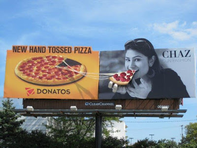
New Product, hand tossed pizza for Donatos

Creative usage of billboard and other out door media is becoming more popular so when the opportunity arises, go big or go home! Make those drivers have something appealing and funny to look at!

Dental Formula

This billboard shows the strength of its product, dental adhesive, with the clever manipulation of the space!

Pepsi Twist

Vulgar to some, hilarious to many; this Pepsi advertisement got people talking about their product! The animation, whizzing lime juice into Pepsi creates the perfect Twist drink.

Raid Spray

I LOVE MARVEL! This ad shows that Raid gets even the BIG bugs!

Potato

Who doesn't love a good spud? This advertisement is another favorite of mine because, other than my Irish love of spuds, the mother humor speaks to me. I believe my fur babies are the best in the whole world, as any loving mother would think about their own (real or fur) baby!

I hope you guys have enjoyed this 10 post journey of mine through the comical world of advertisements but alas this is my final post.  What did you guys think of this list, useful? Funny? Hated it? Tell me in the comment section.


Special THANK YOUS to all my blog supporters throughout this journey!

Thursday, November 10, 2016

Aliens and Avocados


From the start of this aliens in space, futuristic commercial, one would not think the product being advertised would end up being Avocados from Mexico. This 2016commercial aired during large sports games and depicts the following scene. In a galaxy close to our own, a group or aliens tour a museum of creations from earth during this era. Emojis are explained to be our alphabet and several other pop icon items on display include torture devices (airplane seating), the controversial white and gold sequin dress that started the second civil war (shown in black and blue), and of course the amazing avocados from Mexico that are always in season so they can be enjoyed all year long!


What is humorous about this advertisement is its use of popular cultural elements and trends and exaggerating the meaning behind them. Recall the first joke about airplane seating being explained as torture devices, which held humans for hours at a time. Anyone who’s traveled in coach, or first class for that matter, understands the feeling of air travel being somewhat like a package of sardines… we are all packed closely together and stink!


This TV advertisement takes a bit long to unveil the sponsor; perhaps this is a good thing as it allows the commercial to capture audience attention, get them laughing, and then presents the product as the ultimate creation on earth. Using the storyline of alien tourists in a museum of earthly positions worked to impart this message. I thoroughly enjoyed this advertisement, but how didyou feel about it? Is this a funny advertisement to you, why or why not? Was the message delivered effectively in your opinion?

Thursday, November 3, 2016

I Love Marvel Comics

I Love Marvel Comics! While I have never read the actually comic books, the world of marvel has always enchanted and inspired me. What kid didn't dream of having super powers? I always thought that the powers of the mind would be the best because you can use your telekinetic powers to move things with your mind as well as read peoples minds. This means that your can fly simply by moving your body through the air with your mind! And forget about anyone trying to keep a secret from you when you can just step into his or her mind for a sneak peak. For me, no other power compares and allows you to do as much. The most common super power to be displayed throughout comic books, including the Marvel universe, is super human strength.


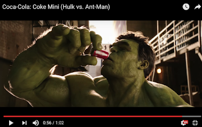
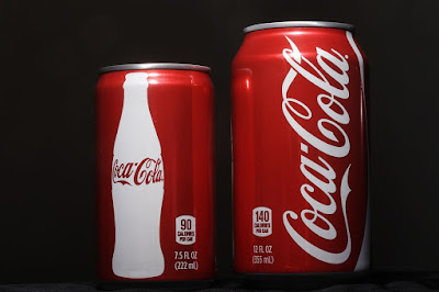
The Hulk, the epitome of strength is paired with the witty Ant man in a hilarious Coca Cola commercial from early 2016. The commercial features two very thirsty superheroes and only one Coca Cola Mini. The fantasticality-thrilling chase is full of witty comments, bashing movements and the cinematography of a Marvel movie. for those that are not familiar with the Coca Cola Mini, here is a picture comparison


Being a lover of Marvel, I instantly gravitated towards this commercial. The message was clear to me as it was delivered using the channel of TV programing and again using YouTube. The use of YouTube reduced all noise in the message and allowed me to pause and replay the commercial to grasp its full comedic effect. The sender, Coca Cola utilized the Marvel brand effetely to promote its product, the Coca Cola Mini. The funniest marvel character out of the bunch, with his scripts filled with witty comments left and right, and the hilarious nature of the Hulk with his inability to speak and clumsy nature, Coca Cola utilized the perfect duo for creating a funny commercial to promote their product.


What makes this commercial so successful and if your brand has the finances and ability, then take a page of the corporate giant Coca Colas’ playbook and produce a commercial that utilizes the following elements: humor, celebrity endorsements and expert cinematography. Do you think this branded advertisement was any good? Do you think it was as funny as I thought it was? Tell me your thoughts on how well you received the message in this advertisement in the comment section!  

Friday, October 28, 2016

Why should advertisements be FUNNY?

Advertising is all about attracting, holding and focusing attention. Noting gets consumers attention more like a hilarious advertisement that is perfectly times and placed.

First off, funny advertisements make people pay attention! I bet before reading this line, you chose to take a moment to look at the image below. The clever play on the word mouse and the important need for clear vision, this Optilens branded advertisement is geared humorously towards the vision impaired.
                             
Take a moment and thing about the advertisements and TV commercials that you can remember most. Do they feature any element of humor? Most likely they do. In my circle of friends, we often share things that are funny to us and TV marketing is not left behind in the conversation.

Since advertisers are often concerned with how to get more attention, humor is a common go to in the industry. According to Why Funny TV Commercials work, “Neuroscience suggests that our attention is instinctively directed to anything that previous experience indicates is potentially good or bad. Loud noises and images of gore attract our attention because we're taught to fear them. But negative associations don't lend themselves well to advertising other than PSA announcements. If the intention is to make people feel good about a brand then enlisting negative emotions to get them to get attention may well backfire even if it is only because the content is out of keeping with the context.

Do you as consumers feel that humor gets your attention??

Thursday, October 20, 2016

Print Advertisements are Funny too!!


This week’s advertisement for analysis is by Schick Razor blades. While a bit dated, it is comical and unique. I like this ad because it speaks to me as a consumer and answers the all-important question when purchasing products in this category. Will it shave super close to the skin leaving me touchily smooth?? To analyze this print ad, I will use the list of effective Print ads from Freedomnewsgroup.com
There are 10 elements to an effective ad;
  1. The product or service: The product in this ad is Schick Razor blades.
  2. Strategic Targeting: The ads persona needs is in line with target consumer market; females who shave.
  3. Provide a strong offer: The irresistible offer in this ad depicted on the tiger once the blade runs over it revealing touchily smooth skin.
  4. Creating a strong headline: I will imply the offer, this is the part at the bottom of the advertisement that says “The power of 4” in reference to the four powerful blades the product offers.
  5. Develop support for the offer: The strong proof is again represented in the tiger tattoo.
  6. Position value: position value of purchase to outweigh the price. I this ad the price is not indicated, nor is it compared to others for a price comparison.
  7. Include strong visual elements: such as pictures that illustrate the message of the headline. The product benefits are humorously represented in the tattoos touchily smooth skin.
  8. Creating a strong CTA or Call to action: This would include gifts, rewards, benefits, and other promotions with time dates to urge the consumer to purchase now. This ad is lacking one. An example of a CTA in this ad would be if it included a date to purchase the product and get blades free or on sale.
  9. Include a tracking mechanism:  This includes leads such as a coupon, dedicated phone number, landing page, etc. This ad is lacking in a tracking mechanism.
  10. Develop a simple clean ad layout: this ad does is not busy and filled with unnecessary images and words. The message is more powerful when the clutter is gone.


Here are other advertisements that follow the same simplicity model:
This ad stresses the importance of finding a car that truly fits both personality and physical body size!

Lastly, this ad reminds travelers that London is entering the perfect time of the year for travel, summertime!

What did you guys think of the Print advertisements of this post? Do you think they were successful in their attempts at being funny, why or why not?